Tips to Use Pastel in Home Interiors
Pastels are one of the most popular color trends that are fashionable and bring a sense of serenity and simplicity to any space!
Photos By: Unsplash
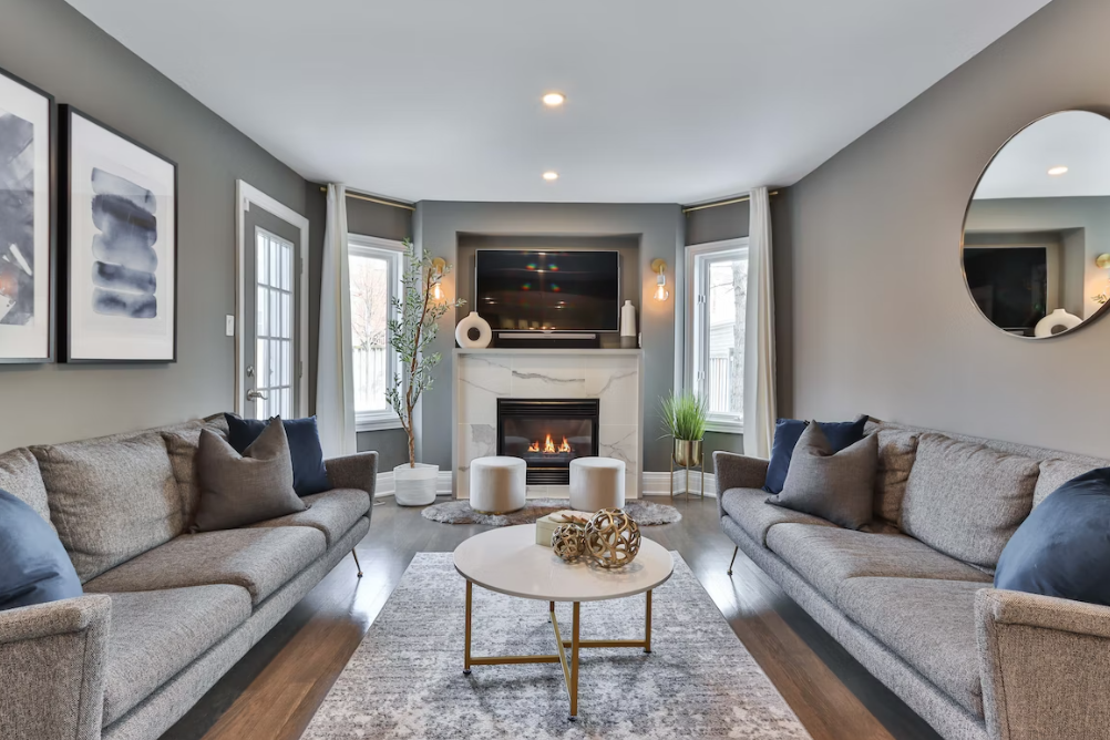
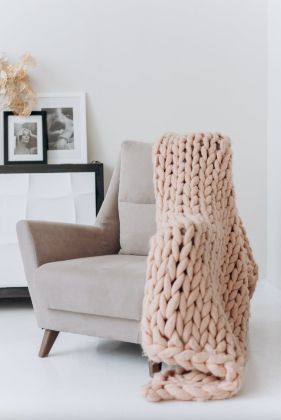
From frosty blues to dusky pinks to the lovely lander and soft yellow, Pastel colors can create a tranquil atmosphere by giving a room a gentle, fresh vibe. Soft furnishings, such as cushions and throws, when integrated into pastel colors.
Pastel-in-home interiors maintain a harmonious atmosphere. You can use a variety of wood tones to add texture and intrigue, with dusted heathers and blues that look great in upholstery and soft furnishings. These lighter tones complement the hues wonderfully for a relaxing effect and soft simplicity.
Tips and Techniques
1. The innovative use of pastel colors is one interior design style that will continue to dominate in the future beyond 2021. Not only in-home interiors but pastels are trending in websites, fashion, branding schemes, websites, etc.
2. Try pastel shades like a whimsy yellow, plum, light azure, rosy brown, millennial pink, burlywood, and creamy white that have made their way into the trending pastel category this season. These colors have a peaceful, calming, romantic, and baby-centric quality that will make your rooms feel cozier and more comfortable.
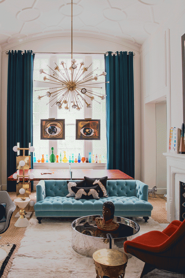
3. Pastel colors aren’t just for feminine styles or the young. Try various shades of blue and give that bedroom an instant male look. Pastel colors with bolder patterns and colors, can create depth and become the focal point of your room when used as accents with other dominating hues.
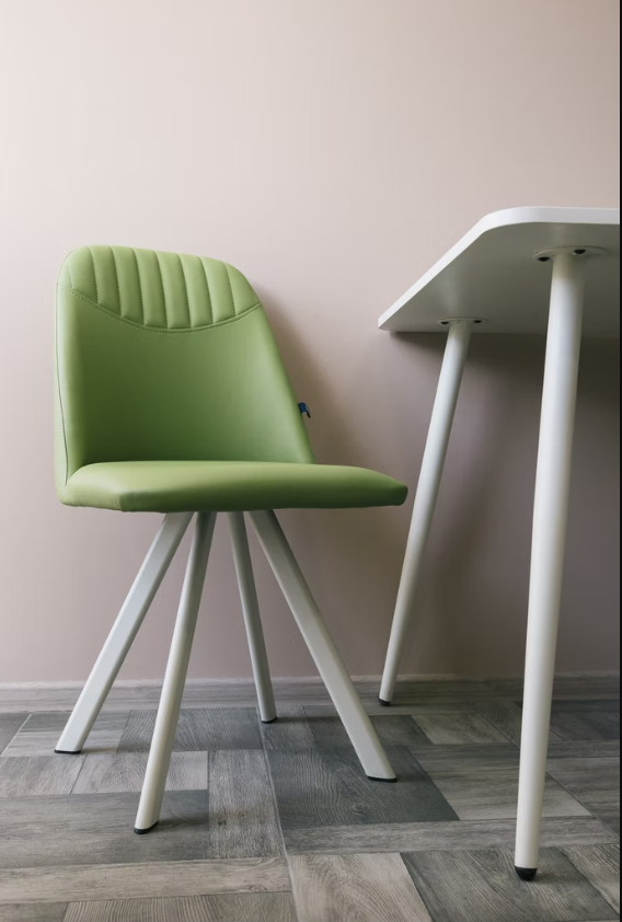
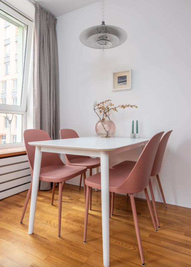
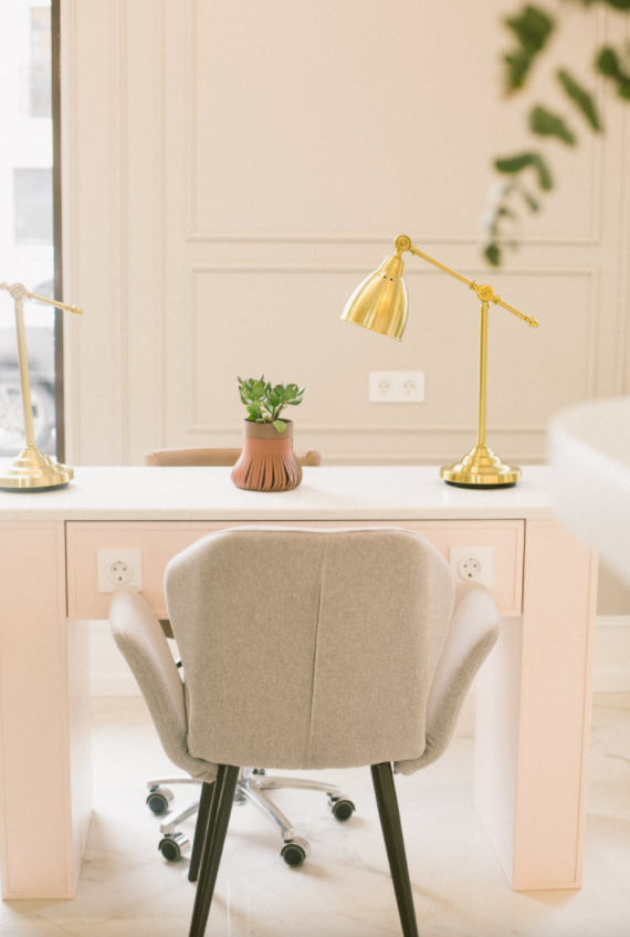
4. Go for a pastel-toned sofa, pale pink velvet upholstery, a distinctively designed table-chair combination in pastels or just a massive center light-shaded table that can make a true stylistic statement.
5. An array of gentle pastel colors can instantly brighten any room with trendy, powdered colors, bright patterned rugs, and accessories in barely-there tones.
6. Try an exquisite and royal design that blends sorbet tones with odd detailing for a pastel wallpaper like Faux tin tiles or a soft, rosy glow pastel-shaded wallpaper that nods to the trend.
7. Fresh flowers are one of the simplest and most cost-effective ways to incorporate pastels into your house. Fill bud vases with everything from lilac sprigs to pale rosebuds to bring nature’s interpretation of the pastel trend to your home interiors
Vibrant Interior Designing Trends to Use Pastels in your Modern Interiors
There is such a welcoming and soothing effect of pastel in your home decor, let’s see how:
1. Enhance the appeal of pastel colors in your interiors
Pastel colors once were combined with bold black and stunning opposing colors. Pastel colors are making a comeback in today’s interiors and in a big way! There is a beautiful appearance of pastels in interior design, whether you are thinking of giving your interiors a facelift or simply adding some pastel accents to your linens.
2. Pastel Kitchen Appliances
Kitchen appliances have come a long way from the days of white, beige, and black. Today’s refrigerators, kitchen appliances, blenders, stoves, and ovens come in practically every color of the rainbow. Whether you prefer attractive pastel kitchen tools or the softly shaded décor, all are available in your choice of gorgeous colors from aqua and lavender to pale blue and buttery yellow. Pastel hues are an excellent way to change a drab kitchen into a vibrant one.
3. Relaxing Interiors
The lighter tones of the color palette for your rooms have a soothing effect. Soft colored textiles, bedding, and decorative decor are perfect for use in bathrooms, bedrooms, and sitting rooms. If you still want your private spaces to have a more masculine feel, blend darker color hard surfaces like hardwood floors with darker color tile and countertops to achieve a balance between the two hue spectrums. There are certain tricks and tips to brighten up the room for certain weather, you can look for pastel hue colours to brighten the room for summer.
4. Pastel Colors Encourage a Country Cottage Look
Pastel colors may be a welcome addition to any home, whether you prefer the laid-back appeal of Shabby Chic interiors or the rustic weathered aspect of classic cottage architecture. Begin with the furniture you like in patterns, solids, or a mix of both. To bring out natural influences, use pastel tones of yellows, pinks, greens, whites, and blues. With the addition of pastel ideas, weathered and damaged wood may provide a stunning backdrop, coupled with vintage discoveries to bring out the country theme.
5. Pastel tone your Furniture Styles
Many homeowners are hesitant to use pastel hues because they are concerned that their property will appear too soft and unattractive. Instead of focusing on the colors, start with furniture that you are familiar with. Your favorite sofa and matching end tables, along with touches of flowers, stripes, or even polka-dotted pastel textiles, will bring a sense of familiarity to your new pastel-enhanced homes!
6. Choosing the Right Wood Finishes
Pastel hues can integrate easily with natural elements in your interiors, such as wood paneling, wood floors, rattan, seagrass, and more. To complement your pastel design and appointments, choose lighter colored woods such as bamboo, white oak, lighter maple, and related kinds. If you want to create a contrast in your decor, go for rich cherry wood, which goes well with pink and peach colors, or mahogany or deep brown stains with pastel yellow, blue, or green for a striking contrast.
7. Pastel-shaded DIY project
There are an infinite number of pastel paint-inspired home interior ideas out there for your latest DIY home project. You can add your very own personal touch to the lovely ombre-painted pots or pasted-shaded farmhouse chairs, painting a wall with a fresh coat of pastel yellow, etc.
8. Reinvent a new Muted Neutral
We only think of the apparent pastel colors like yellow, pink, blue, etc., but you must explore the world of other muted tones, like lilac, “grey” tones, etc., that depict the various color saturations. Mixing deep red and yellow can give you a pale orange pastel which looks quite exquisite.
9. Let pastels Inspire your design creativity
You will be surprised to see the myriad of pastel shades around you. Incorporate that in your home and grasp the eye-soothing and peaceful impact of these soft hues in the interiors of your abode. You can have pastel-shaded curtains, walls, flooring, or showpieces, to have a composed and dignified look.
10. Go for Layering
You can layer your furniture and fittings with colorful soft furnishings that can completely transform the look of your home’s interiors. Layering offers a warm and stylish appearance. You’re mistaken if you believe pastels are solely for kids or women. Try mixing all shades of blue, like navy, sky blue, and turquoise, and you will see the overall manly bright effect it exhibits. Always remember that a pastel palette, when mixed with richer colors and patterns, serves to create depth and can act as accents with other prominent hues.
11. Mix Pastels with Brights
Combining soothing grey with pastel yellow might not seem like a good idea. When grey is paired with bright pillows and vividly colored textiles, however, it is difficult to overlook this impression. Choosing a comparable color for a few more accessories across the room, complementing pastels with bright hues, will ensure the right balance of this design plan.
Conclusion
With all of the knowledge on how to use pastel color palettes in your home’s interior design coming your way, it will be easier for you to build your pastel paradise. It’s time to turn your home into a haven of peace and tranquility with modern and subdued pastels in the proper proportions! Let’s be honest about it. We have a sweet spot for lighter Pastels, no matter how much we love our bolds and Brights.