A Guide To Mixing & Matching Patterns Effectively
Many of us shy away from mixing patterns out of fear that we won’t make it right and that it will strain the eyes of the people we invite into our homes!
At the same time, there is something extremely alluring in the dynamic and depth mixing patterns and colours can create—a space full of energy and textural interest that leaves us marvelling.
Mixing patterns remains one of those chimaeras of interior designs – complex, risky, yet beautiful, leaving us wondering where to even begin. Between colours, cushions, curtains and upholstery, there is a lot to keep in mind, and it can be overwhelming.
However, there are some simple rules you should follow to guide you in selecting the right fabrics and colours. Before you know it, mixing and matching patterns will no longer be scary but second nature!
Set The Mood & Choose The Colour Scheme
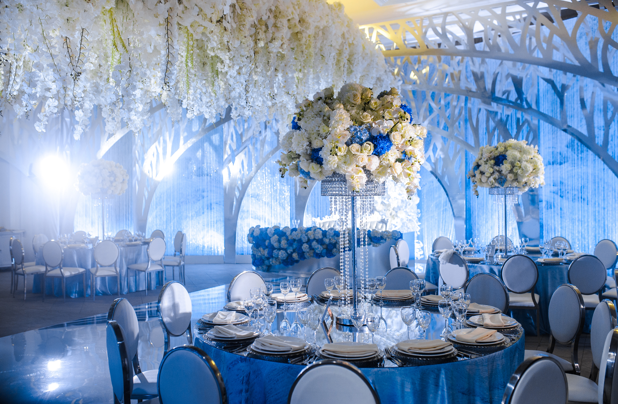
Before you even start considering the patterns themselves, it is worth taking a step back and thinking about what mood you would like to emulate in the room you are transforming. Knowing whether you prefer something more dramatic or you want your space to be cheerful will help you choose the right colour scheme. For example, deeper, darker colours will create more drama and intimacy, while a lighter colour palette will bring warmth to the room.
Once you know the mood and colours you want to focus on, then choosing a pattern becomes easier. Light florals in pastel colours will create a more gentle, inviting atmosphere, while geometric patterns work better with colder shades for a smarter look. Whatever your preference, just make sure all patterns share at least one or two common colours from the scheme and mood you have chosen.
Follow the Rule of Three
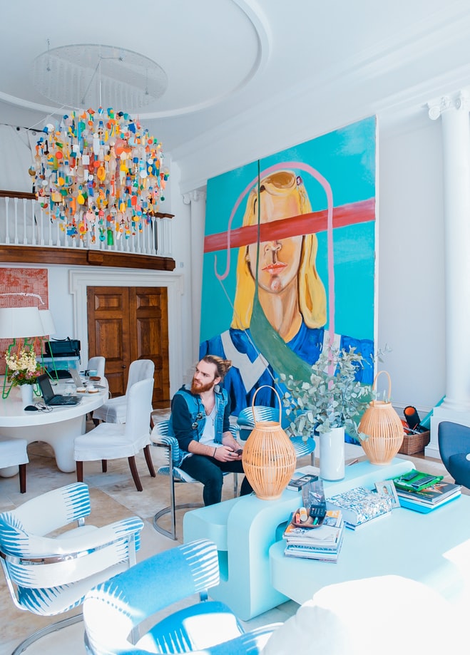
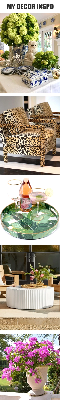
Mastering the art of mixing and matching patterns becomes much easier once you incorporate the Rule of Three. This means combining small, medium and large-scale patterns across the room. For example, select a big motif or single image to act as the room’s visual weight and focus. From there, you can start building the medium and smaller patterns into the room through rugs, gallery walls, cushions, and even tiles.
It is important to keep in mind the intensity of your patterns as well so you can balance them successfully. If you are unsure, you can judge intensity easily, simply notice if your pattern has a lot of colours and shapes in it, this is a good sign that it’s pretty intense.
But How to Make Sure the Styles Work Well Together
This is possibly the hardest part of mixing and matching patterns, but it is also its magic: seeing patterns from different eras, in various colours and motifs, seamlessly work together when they seemingly shouldn’t. Contrast does add interest and emphasise different aspects of the patterns, but achieving harmony requires a trained eye.
To help you achieve this magical balance of opposites, take notice of the artistic language of each pattern. Is it digitally printed or handcrafted? Sewn or drawn? Are the images realistic or stylised? Are the lines crisp or clean?
Additionally, texture will play a significant part in sorting out which patterns work well and which don’t. For example, silk will clash with rugged canvas. But linen and velvet are a match made in heaven.
Usually, we don’t buy our decor all at once. Instead, we tend to collect it over time, and this can actually be a good exercise to take stock of the patterned pieces you already have in your home and try to identify gaps and opportunities to introduce a new print.
Give Patterns Space to Breathe
Talking about so many colours, motifs, and shapes, naturally, you might wonder, “Wouldn’t this be too overwhelming?” Yes, without the right balance, patterns can strain the eye.
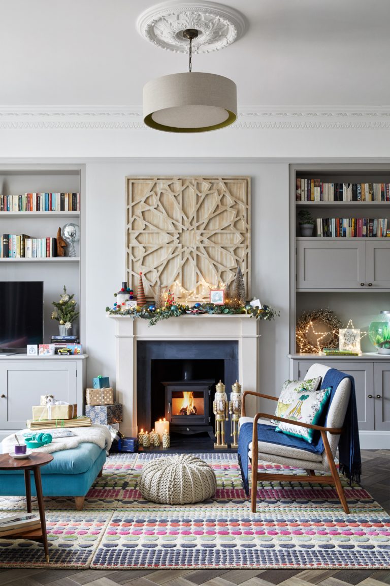
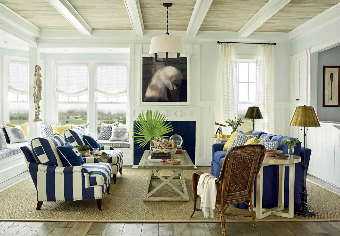
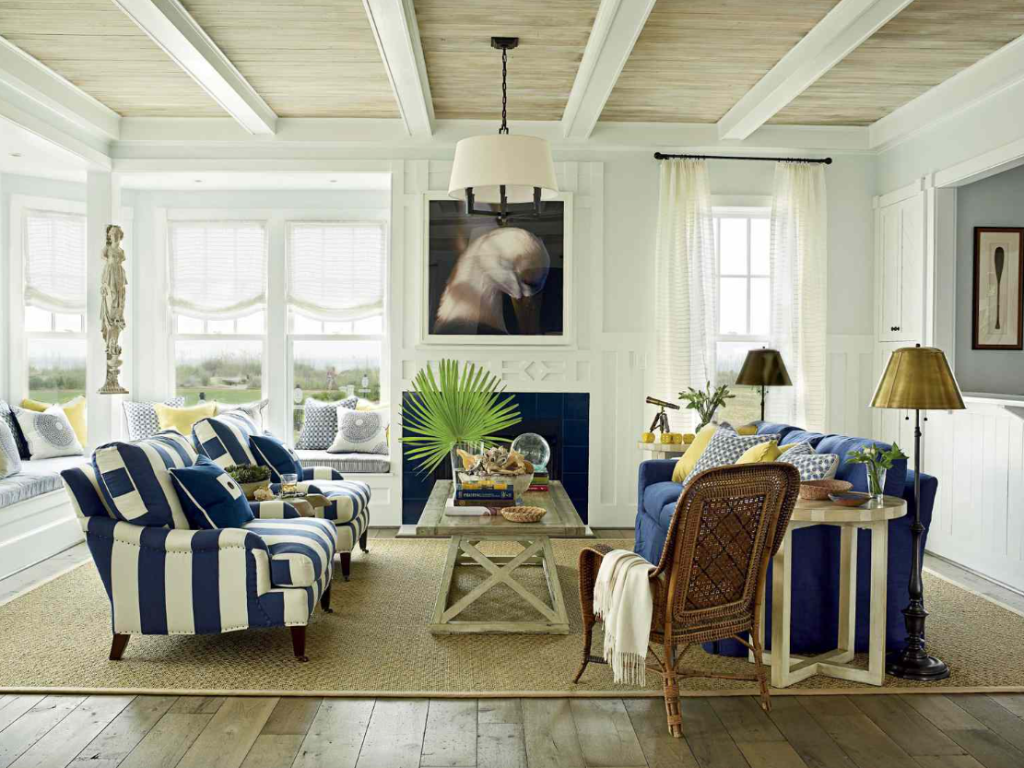
To avoid this mistake, it is crucial to introduce solid colours in the room that will act as a visual resting point from the patterns. For ultimate harmony, combine intricate, detailed patterns with simpler, more subdued ones. So, if you have a bold floral wallpaper, for example, ground it with solid-coloured furniture or neutral-toned textiles, and you will quickly achieve a cohesive look, avoiding a chaotic feel.
Thoughtful placement of solid colours and patterns will also help each print and pattern stand out without competing for visual attention.
Use Patterned Accessories
If you are still a bit timid about trying a big patterned room transformation, you can play around with accessories like rugs, pillows and curtains to provide an easier, non-permanent way to experiment with different designs.
For example, you can introduce bold prints in your space without committing to permanent changes like wallpapers by opting for abstract prints instead. These, especially as a gallery wall, can be a great way to tie patterns together, creating a dynamic in the room without disrupting the cohesion of the space.
Pattern Mixing as an Art
It is a dance of balance and a sense of style that you can master with time and that will give you the skill to transform any space effortlessly into a heaven of harmony, energy, and beauty.
To achieve this, always remember to start with the mood and build your design from there, introducing solids for visual rest and emphasis.
Don’t be afraid to experiment, make mistakes and start again. Mixing and matching patterns is a skill developed with time, but the process is just as exciting as the results can be. Ultimately, while searching for a balanced look, you will also discover your unique self and intertwine it with the atmosphere of your home.