Get Stylin’ with Pantone’s Top 6 Trending Colors for 2014
The Pantone color report is officially out! Numerous gorgeous colors were chosen to start off the 2014 year in style and in color. We’ve picked out 6 of our favorites with tips on how to incorporate them in your existing home décor:
Dazzling Blue
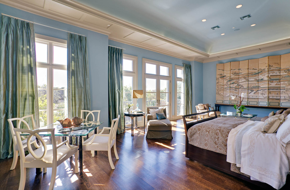
Dazzling blue is my color of choice for 2014. This color sure can be dazzling and powerful, so use it with caution. Choose one room you want to makeover and slather on a thick lick of dazzling blue paint, right above a chair rail molding. Paint the inside panels under your chair rail a darker shade to offset the blue and to avoid your space looking like a “Greek” themed home. That is a look you definitely do not want to be going for this year, so make sure you do it right! Use furniture in dark colors like black as well as a mix of cream-colored furniture. Stay far away from white colored pieces, as they do not work well with this color.
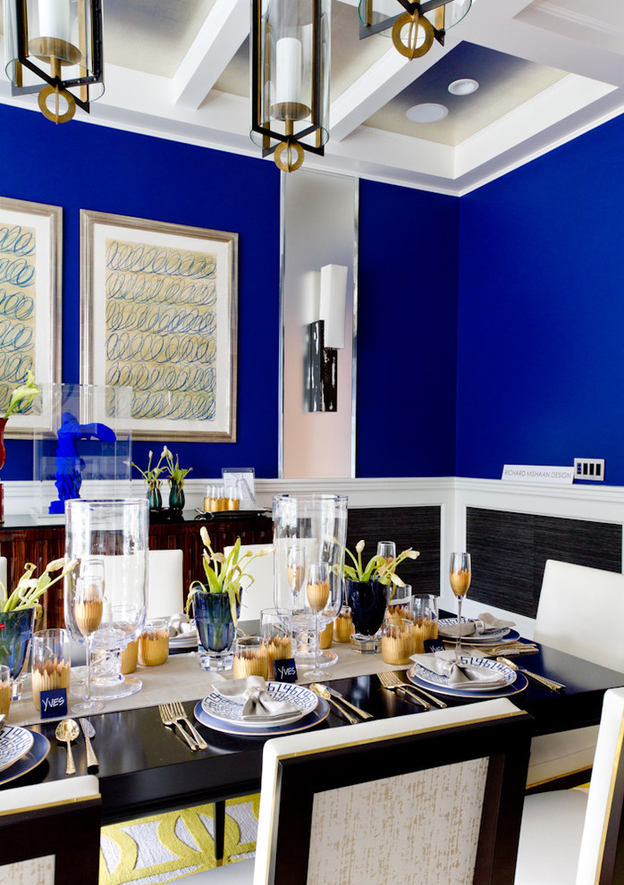 Rikki Snyder
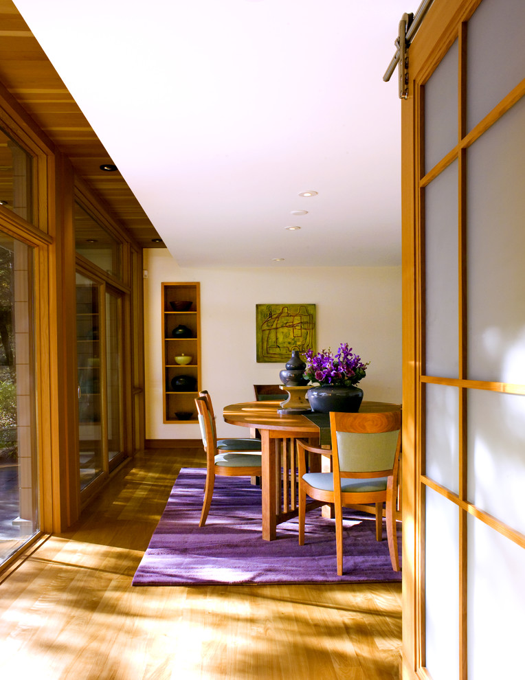
Sand
If you like decorating your home in safe colors that work well with just about any other color you may currently have in your home, sand is a great color for you this year. From top to bottom, you can wrap your whole room in this color, which will instantly make it bigger and brighter. Sand is one of the prettiest neutrals and anchor colors that mix well with soft pink, blue, brown, and gray.
 Houzz
Houzz
Freesia
Freesia has hit the runways this season, and can creep its way into your home from walls to accessories. This bright floral shade is perfect for risk takers. If you are set to take the plunge, slather on a few layers of freesia with a lacquered, glossy finish. The hit trend for 2014 is to make a room look like a jewel box. To achieve this, complement your new glossy paint job with gold chandeliers, metallic wallpapered ceilings, lots of mirrors, and gold leaf furniture.
 James Yochum
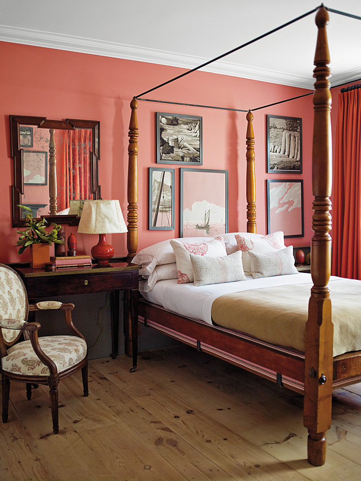
Cayenne
Cayenne is a sweet, muted color that looks similar to the color grape fruit. There are a couple of different types of cayenne that vary between a peachy orange or a brownish orange. Whichever you choose to decorate your home, you can start off small with accessories such as throw blankets, pillows, and rugs. This designer went all out by painting this bedroom top to bottom in gorgeous cayenne and complemented it with fab flooring, and a rich, cherry wood bed set.
 Abrams
Radiant Orchid
If you are looking for the ideal color to greet spring, choose radiant orchid. I love using this color in small doses sprinkled throughout my home. A lush orchid rug, or a gorgeous bouquet of orchid flowers can work miracles in a small or large space.
Marcus Gleysteen
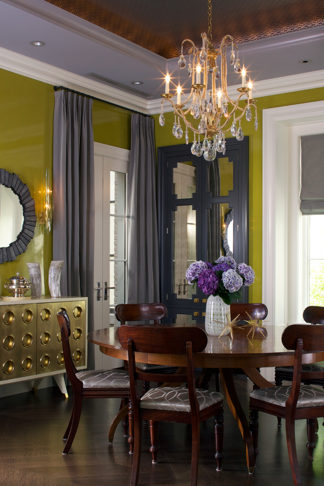
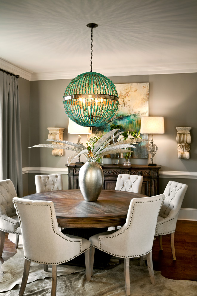
Paloma
Grey was a hit color a few years back, but it has come back in style in a new shade: Paloma. Far from the dark elephant greys we saw a few years ago, paloma is a softer shade of gray that works well with silver, sand, and turquoise. Notice how the designer created depth in this dining room by using a soft paloma above the chair rail and a dark shade below. This makes expands your space, and visually raises the ceilings up a bit. A great trick from the pros!
 LGB Interiors

These colors are really dazzling…I am just stumbled on your blog. Each and every corner is heavenly beautiful.
James Yochum’s Dining Room in the Get Stylin’ with Pantone ad.
What are the paint colors (name and brand) of the Chartreuse and grey walls?
Style: Eclectic, Location: Chicago